Today I had some 20 minutes spare time and I wanted to try games my co-workers had recommended for me.
Heartstone
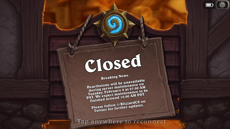
First off was Heartstone - Heroes of warcraft. I had opened the game day before, and was in the middle of the tutorial story. Opening the game again got me slowly to the same tutorial spot… except when I clicked “Play” I got this:

Three hour maintenance break is looong, but I can live with that; there might be a valid reason (like earthquake or tsunami or blown up data center). Instead, what irritated me, was that
- the game did not tell me from the get-go that service is closed. Made me wait extra 30 s.
- times are not in local format; it should not come as a surprise to anyone that AM and PM are not universal notations.
- I’m required to know both current time, and my time difference to PST time.
The last one is the worst: it puts extra cognitive load on the player. Personally I never figured out when the maintenance break ends - I would have needed to open a timezone application or google timezones to figure that out.
Instead of the above message I would like to see maintenance break expressed as duration, e.g.
We are back online in 1 hour.
Vain glory
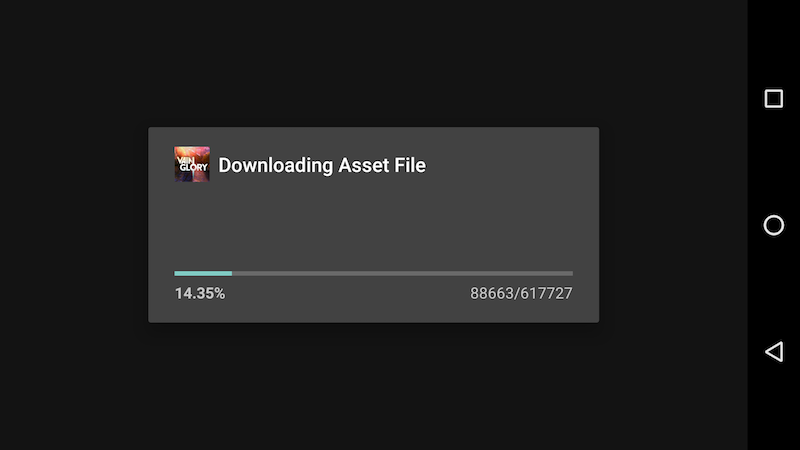
As I never got to play Heartstone, I took the next game in queue: Vain Glory. This game I had installed, but never opened. The first user experience I got when opening was this:

First of all: why does the load take 15 minutes when I’m on a 100 Mb network? Very few people are willing to wait this long for a game session. Normally 500 MB of content downloads fast, but this game is different.
Secondly, what are the random numbers on the lower right of the modal window: no units, no formatting, just random. There already is a very clear percentage and the progress bar, why add extra clutter?
And last: does “Asset File” mean something for normal people? In my opinion that is pure game development jargon and should not be shown to players. Most people don’t even know that there are real files loaded in the background.
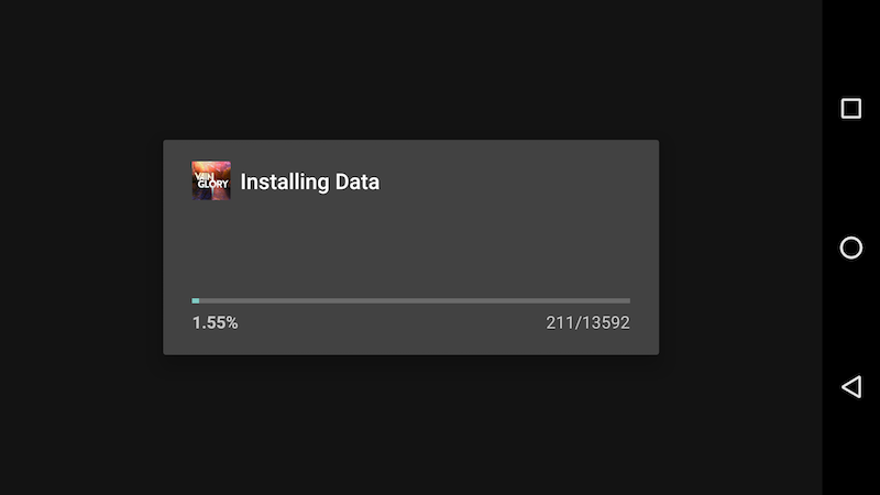
After all the waiting - just when I thought I would get to play - the game disappointed me with second obligatory wait! And of course with another completely meaningless message: “Installing Data”:

I have the most powerful Android device ever made - the Nexus 6P - and this phase still took 10 minutes. And I have no idea what the game did for all that time; maybe it calculated prime numbers or did some crowdsourced computing for public good? If there is this heavy computing involved, why isn’t it pre-computed on the game backend?
As a player I would like to see a maximum of one wait with clear progress bar. It should take max minute or two on a fast network, and have an uplifting message made for humans. I’m not an english native, but something along the lines of
We are loading some high quality content for you and it will take a while, but it will be awesome!
Alternatively no waiting at all for first time experience, and downloads could continue in the background or when player advances in the game.
Result?
In the end my 20 minute of time was spent and I did not get to play for a second. Game studios did not get a dime from me, and my time was wasted. Loose-loose.